This case study was given to me to complete during my hiring process at Google. It has been included to showcase a portion of my design process.
The Prompt
Design an experience for students to discover orientation events and craft a visual system to accommodate different types of events: sports, music, visual arts, social groups, and volunteering events.
Try the interactive prototype below to help you find an event !
Research
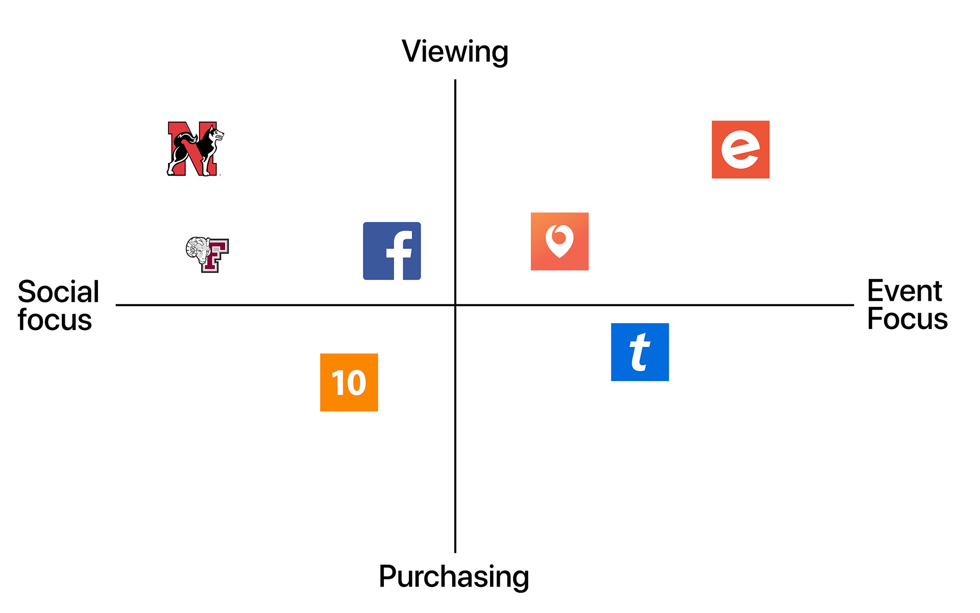
I began my research by conducting competitor research on applications that specialized in events, and features schools utilized to advertise orientation specific events.
In addition, I conducted user surveys (60 responses) and interviews with 15 undergrad and graduate students to gain insight on their experience searching for events.
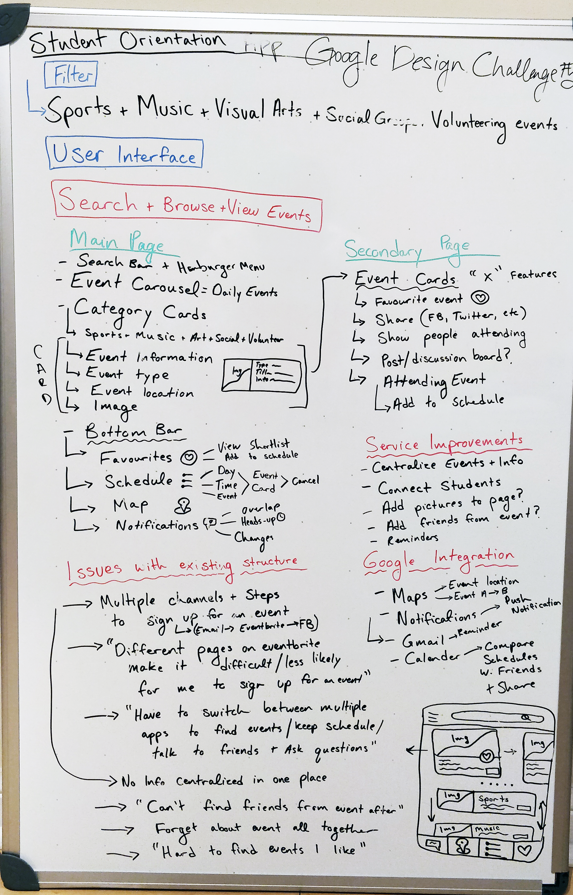
I segmented the information into personas and data groups to better understand the general user journey, pain points, and use cases to begin creating a design solution.
Finding the Problem
How can we make it easier for students to discover orientation events that interest them? Orientation is an important event to students because it provides opportunities for them to meet new people and discover new experiences. The underlying problem is the existing infrastructure makes it difficult for new students to discover, manage, and reserve tickets to events; as a result students don’t attend orientation events because they are unaware or don’t find events that interest them. This is problematic because students miss out on valuable experiences that can have a substantial impact during their transition to university/college.
So what are the obstacles students face when trying to discover events? From my research I identified how the existing means of discovering orientation events hinder students experience:
“ There was lots of emails for events which linked to various Eventbrite pages, it wasn’t clear how things worked and I had to always check my email to see if there were new events. I wasn’t willing to sign up for everything because the process was so tedious, and it was a hassle to maintain all the emails “
“ I didn’t check my emails before starting school, and by the time I found out events would be full, and I wouldn’t know until too late “
“I am the least organized person, I would take screenshots of the schedule and constantly check them or set reminders on my phone so I wouldn’t forget about the event. “
“ Not all university wide events are listed on the email and it became difficult to find the ones I liked again after leaving the initial page to reserve my ticket”
“ I would have to look through my emails for the ticket, or event info and it would get lost among everything else in my inbox “
“ I wanted to know who was going to the event and it was difficult to share or compare schedules with other people “
I was able to better understand the pain points throughout the various stages of each user's journey. The lack of a dedicated event platform resulted in users constantly having to change platforms in order to perform a task and this detracted away from their willingness to discover more events.
There was no further points of engagement or reminders once the user received their ticket, and users often forgot about the event or had a difficult time recalling the information.
Users main priority when attending orientation events was to socialize with new people, however there was no way to determine who was attending the event.
Solving the Problem
The main goal is to help students discover events that match their interests. The application helps users discover highlighted, recently viewed, and categorized events; this allows users to search for a diverse range of events while providing all the necessary information for them to attend.
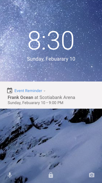
Push notifications create engagement with events that they favourited, interested, attending and are new. It is key to remind users about events so they are always aware of the details or other events that interest them.
A section on the event page will show users who is attending, and allow them to post on a discussion board. This will create social interactions allowing users to engage with others interested in the event.
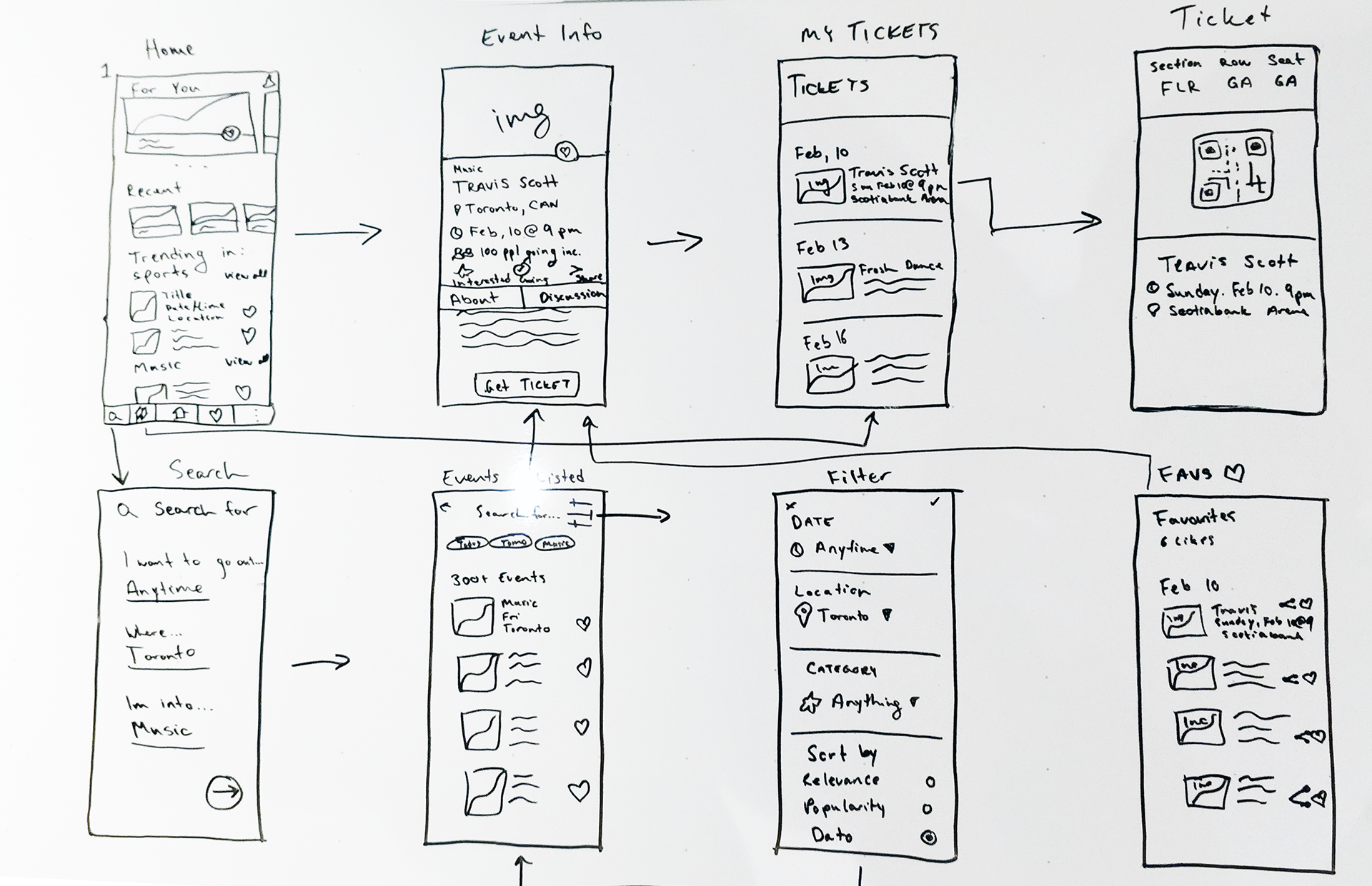
Wireframe
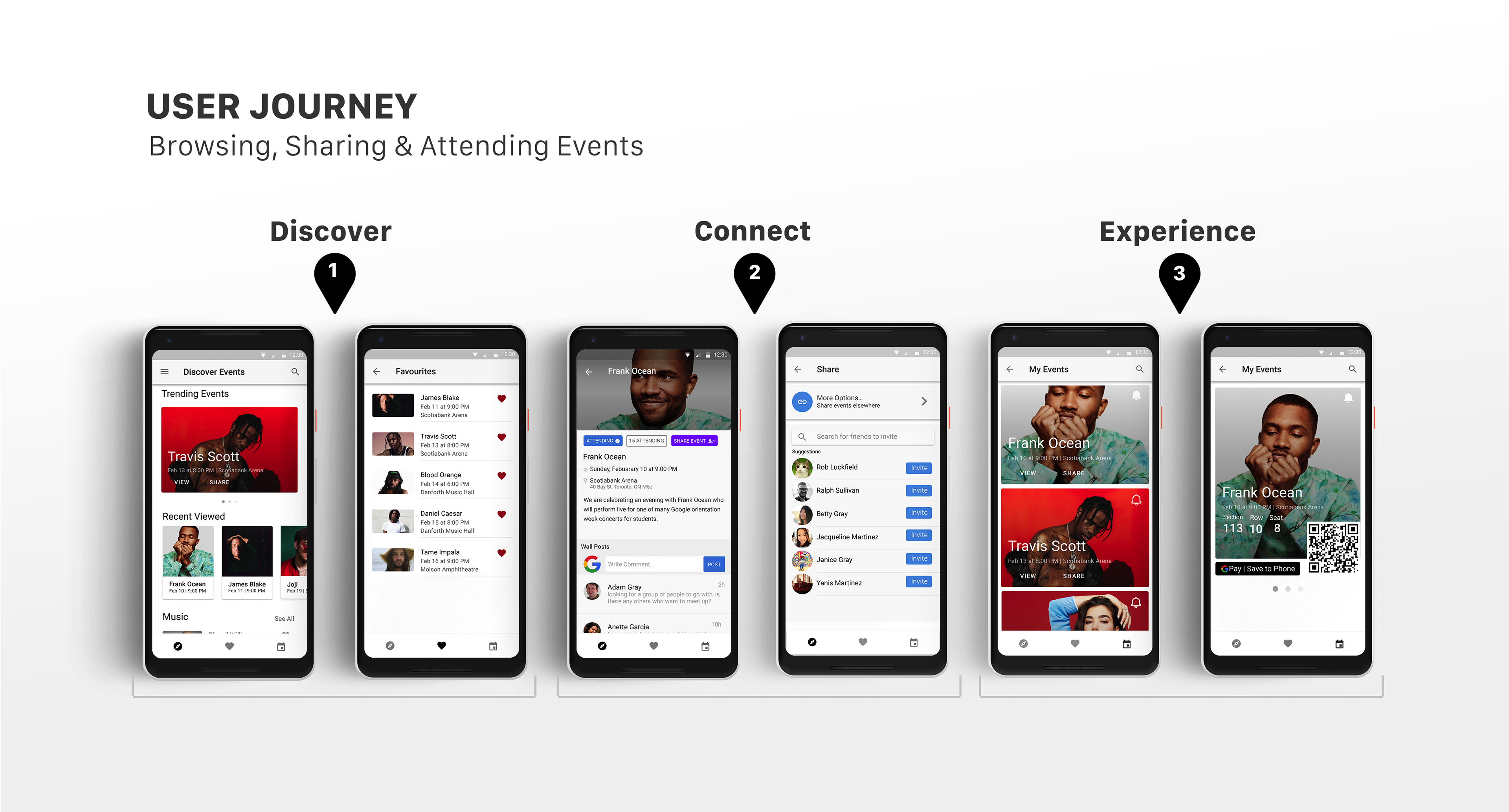
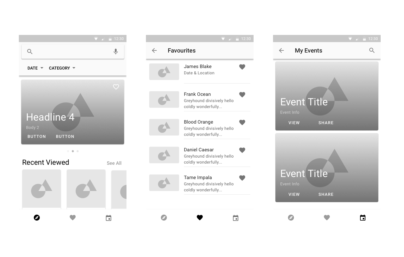
I decided to use a navigation with 3 views: Discover, favourites, and My Events. Each tab on the navigation represents a different cycle towards discovering and attending events, the user will move along the navigation bar from left to right representing each phase in the user journey.
The navigation represents the different phases of the user journey from discovering events, saving, and attending them.
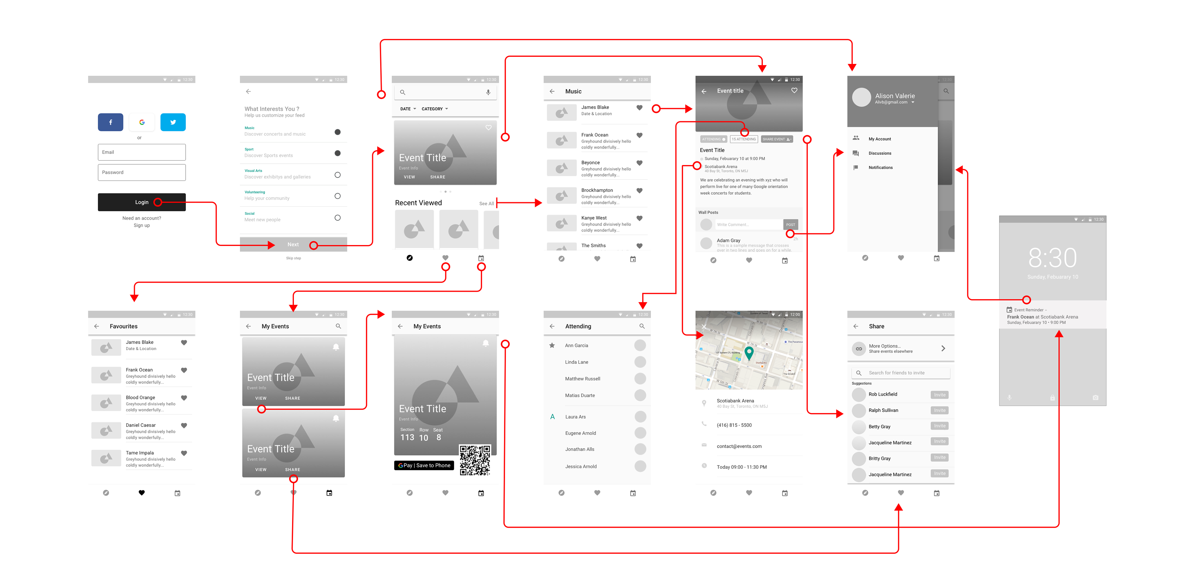
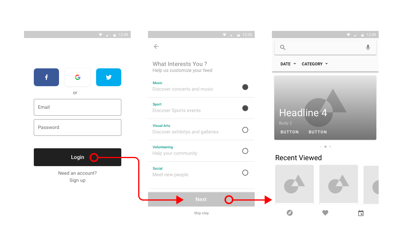
Onboarding
The login screen allows the users to connect to various social media sites or use their own account to sign in. This feature allows users to see which friends from their social media networks are attending, post in discussions, or share events directly to their profiles. This feature will help users discover other individual attending events and help facilitate more social interactions before and during the event.
The next screen is a brief questionnaire which explains to the user why completing the questions will help filter the results to their individual preferences. Adding the questionnaire makes the user feel that the results are personalized to their interests, and increases their retention as they scroll through all the different events on the discovery page.
Users have the option to skip this step where they will be directed to the discovery page, however the results will not be filtered in the order of their interests. However users can use the search function to narrow down a specific category they are interested in, even if they don't know exactly what they are searching for. This further promotes the idea of browsing, and sharing events through the users being exposed to so many options.
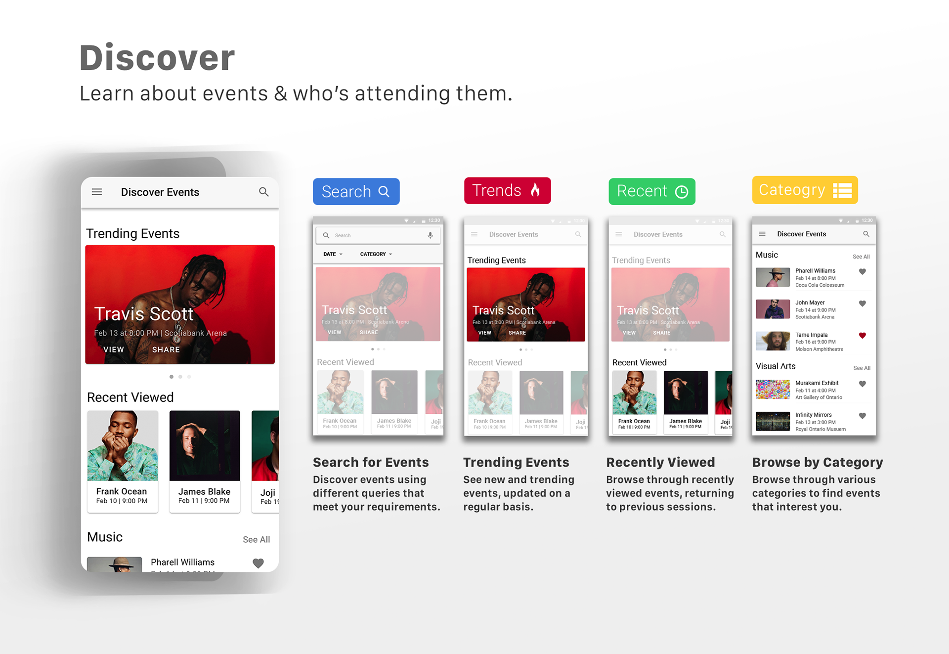
Discover
The discovery page centralizes all the events that are personalized to the interests of the individual based off the onboarding questionnaire. Searches can use filters to help users further personalize and rank their results while browsing. Through browsing users can see the information of various events in each category, and save them to their favourites.
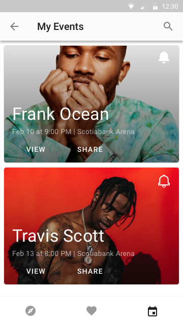
All the event cards on the display page provide the basic event information to the user, allowing them to quickly save any events of interest without requiring them to click on the event page. This allows them to continue browsing various events in each category without detracting away from their flow. Users can also see new trending events and events they recently viewed allowing them to pick up where they left off when last on the application, and be aware of new events that are posted.
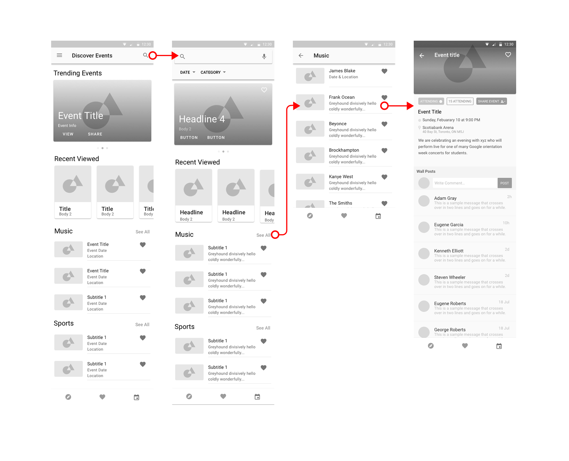
Events
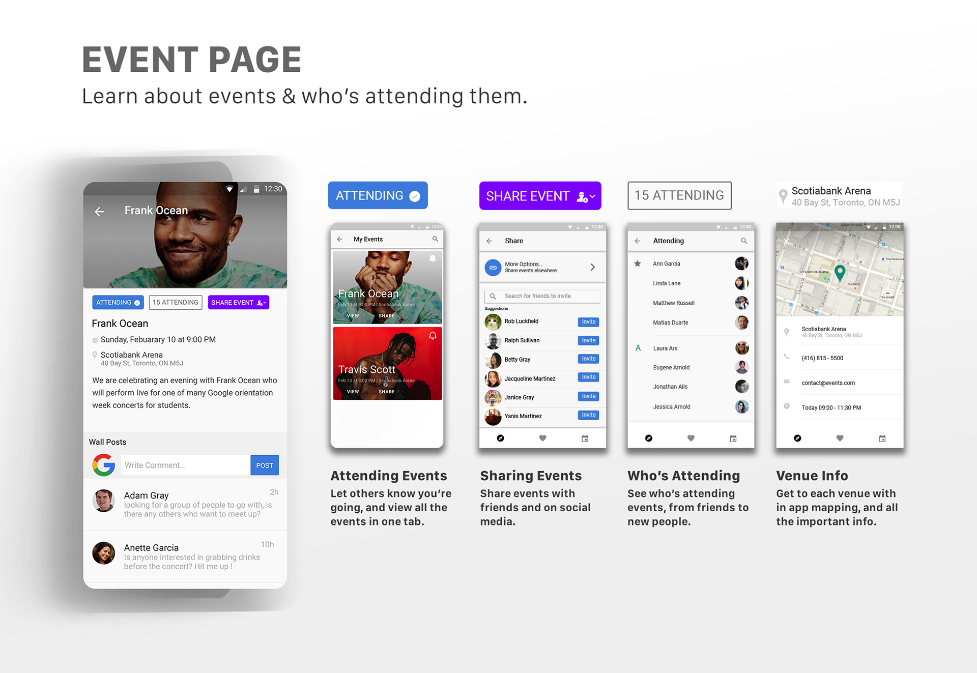
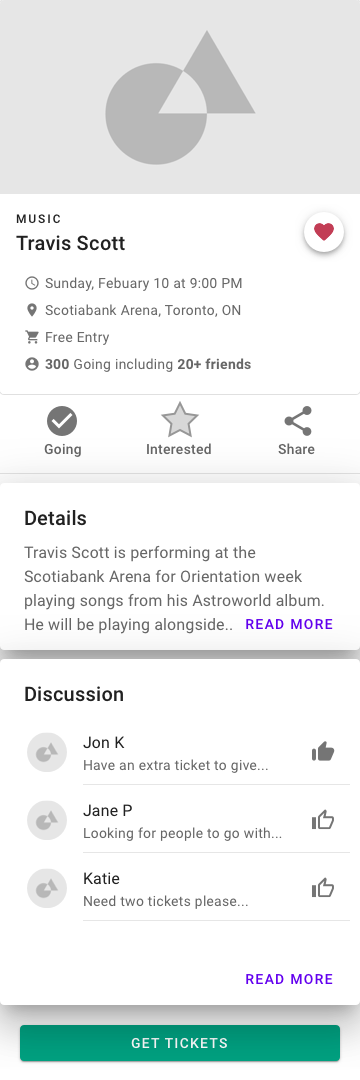
A primary reason for attending orientation events was for the meeting new people. I displayed the most important info to help users decide if they want to attend an event, based on this they can add it to their favourites or confirm their attendance, adding it to the events tab.
Meeting new people can be difficult so to better facilitate interactions before and during the event, users can see who else is attending and meet new people through the discussion board. Through sharing the event on social media or inviting others, people can make new friends while being able to discover new events that interest them. Users can quickly browse through their suggested friends or search for individuals they want to invite, the platform leverages the users social media account allowing them access to various channels to share information with others.
The event venue is also an important element when deciding what to attend; by providing venue information and directions through integrated Google maps, users are able to find the event and coordinate with others where to meet without having to switch between applications.

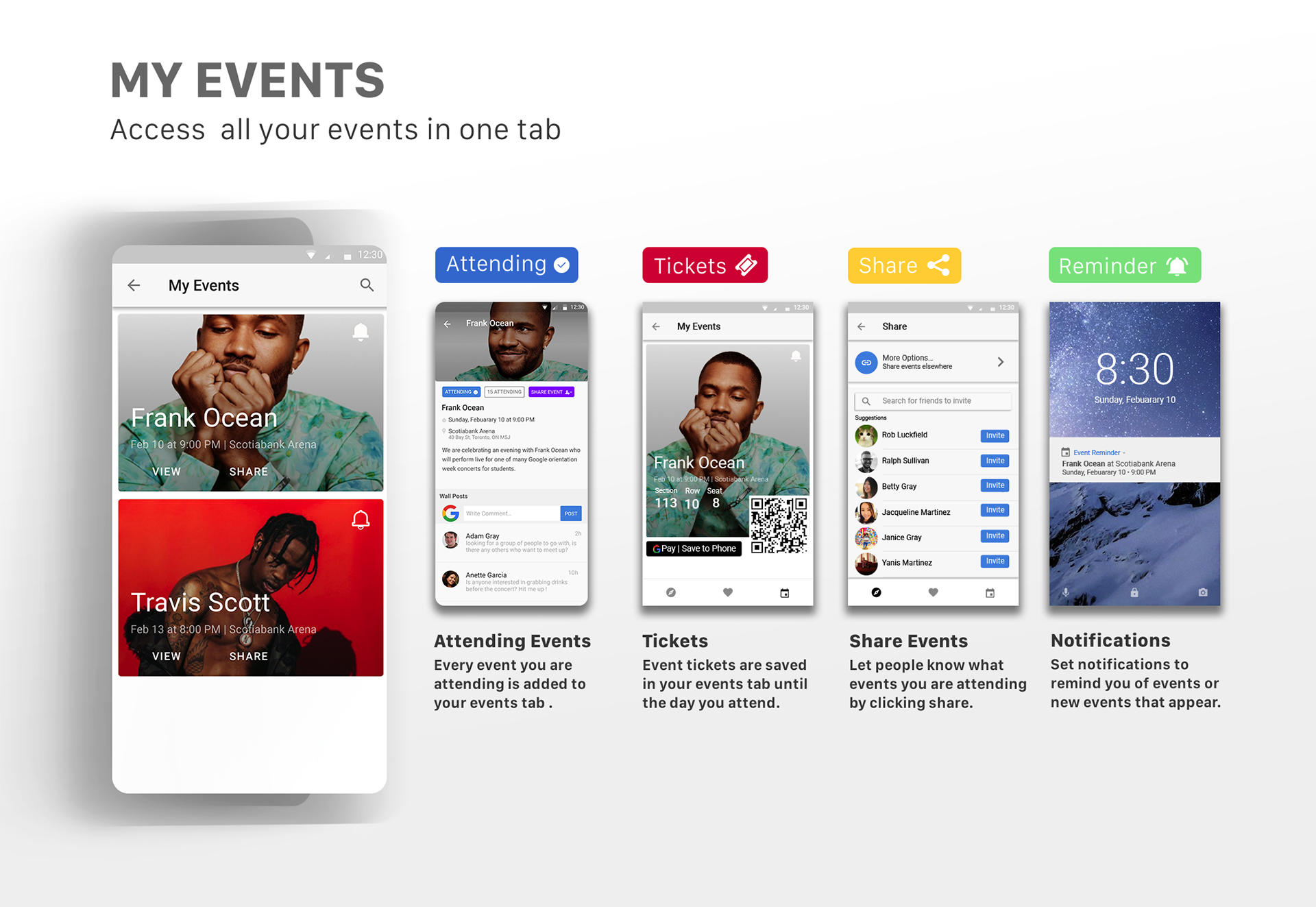
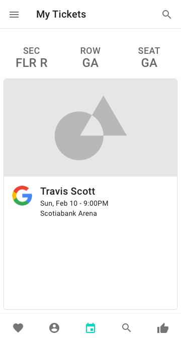
Your Events
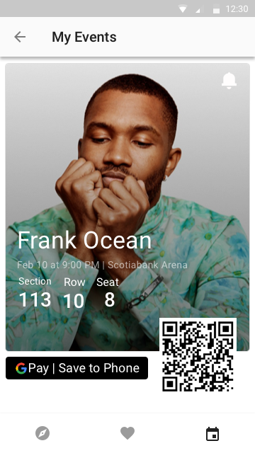
Users can keep track of all the events they are attending, share them with others and set reminders through google calendar to ensure they never miss an event. The ticket is easily accessible at the time of the event and can be saved to the users phone using Google pay integration. The ticket is saved on the app so the user no longer has to keep track of numerous emails or pdf's with their important information, by simply tapping the events tab they can retrieve all the necessary information.

Usability Testing
I used my wireframes to conduct usability testing with users to gain feedback about the flow of the app and important features they thought would be helpful. The users were tasked with:
1. Confirm your attendance to an event and find out who is attending events that you're interested in, invite your friends to attend as well .
2. You arrive at the concert venue and need to show your ticket for entry.

1. Event Information was hard to follow with so many elements in the top section in different hierarchies, and it would make deciding on events more difficult due to overloading users with information. The users all had to scroll all the way to the bottom of the page to reserve a ticket, which may not be apparent to some users when initially trying to get a ticket.
So I made the action buttons at the top, so users can skim the fundamental information while deciding if they want to attend an event or not. The primary information includes: seeing how many people are attending, date-time, location and the discussion board. Once the user clicks attending the ticket is automatically added to the users event tab where they can keep track of all their events.
By centralizing all the important information and features users can make decisions without having to navigate through the page to meet their objective. This reduces distractions and user frustration when they want to quickly reserve a ticket, given that they know the basic information from the discovery cards.
2. My Events + Tickets were another function which I changed to better optimize how users browsed through events, even after obtaining a ticket. I removed the ticket information from being directly displayed on the landing page for events because it made multiple tickets hard to naviagate and read when scrolling.
I created more features to help users remember, share and view their tickets. Users forget about events if there is no point of interaction after the initial purchase, and tickets are usually stored in an email or pdf until the day of the concert. If a user forgets there is no way for them to know about all their information, however by tapping the reminder icon a push notification is sent to them. Users can adjust the frequency in their settings, however by receiving event reminders and new event notifications, user awareness and retention would greatly increase, greatly reducing the chance of missing an event.
Lastly, an important element is going to events with friends and meeting new people, by sharing these events it allows more people to connect and spread awareness of the events across different platforms and social media. Ultimately it raises user awareness and promotes events for others to discover.